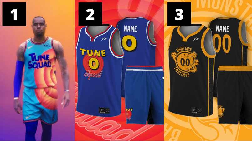
With the new Space Jam movie inching closer to its 2021 debut, lead Lebron James has revealed the new Tune Squad jersey designs and fans are mixed with emotions.
While in a school environment, we have brand guidelines and color swatches to stay within, the designers for the new Space Jam jerseys had fun with their creativity this time around — taking some aesthetic leaps from the simple white, black, and red jerseys we saw on Michael Jordan and the tunes in 1996.
Let’s take a look at the new jerseys and some fan concepts for the two Space Jam teams — Tune Squad and Monstars — to inspire our next shirt concepts.
Design 1: The Official 2021 Tune Squad Jersey
The new Tune Squad jersey amplifies the classic Looney Tunes to a full side-shirt design, allowing you to see half the visual on both the front and back.
It’s definitely bright, bold, and a big brand change from the original.
Our takeaway? The sleek sponsor placement of the Nike logos at the top left of the jersey and the bottom left of the shorts. Sometimes our sponsorships end up being too loud and detract from the core brand.
Design 2: Tune Squad Jersey Fan Concept by Nick Port
This next design comes from Nick Port: “The design has been based off the classic 1991 All-Star jersey with a custom colour scheme and logo created to suit.”
Our takeaway? Brand recognition. Nick builds off the original Tune Squad color palette, giving a sense of familiarity while still expanding into something modern and new.
Design 3: Monstars Fan Concept by Nick Port
This next design also comes from Nick Port, but now for the opposing team the Monstars. For this one, Nick says: “The Monstars share a few traits with the current "villains" of the NBA.... the Golden State Warriors. Just like the Monstars stealing the talent from the best players in the world the Warriors ability to steal talent through free agency has placed them as villains in the eyes of many NBA fans.
The design has been based off the Warriors city edition jersey with a custom colour scheme and logo created to suit.”
Our takeaway? Keeping the color palette to two colors allows for simplicity and clarity.
.png?width=789&name=SL-Jerseys%20(1).png)
Design 4: Tune Squad Fan Concept by Conrad Burry
This design is closest to the first Tune Squad jersey from the original Space Jam. Creator Conrad Burry said he made a font similar to old teasers shared.
Our takeaway? If your school has a classic look, there will always be a sense of nostalgia and belonging to it. There doesn’t always need to be pressure to modernize and change the way things look.
Design 5: Tune Squad Fan Concept by Alex Rocklein
This design from Alex Rocklein takes a very different approach: “I pulled out the Looney Tunes bullseye and used that as a modernized accent.”
Our takeaway? Don’t be afraid to try something new. While brand consistency is important, sometimes a new take can help freshen up your entire team.
For one movie, there’s a number of different visual takes here for their basketball jerseys. Whether your team is looking to redesign their jerseys, order a few new ones without stressing about non-bulking fees, or in need of a new logo, we’re here at SquadLocker to help.
Share this Story


