 Recently, ESPN.com uniform expert Paul Lukas has been running a feature on the website that ranks teams in each of the four major professional American sports based on their jerseys’ appeal. Lukas’ Uni Watch Power Rankings are debatable, and he even admits to letting personal biases dictate his positioning of teams. However, it would be difficult to find anybody who studies uniforms quite as closely as Lukas. Consequently, his recent NHL team uniform rankings reveal a great deal about what works—and what doesn’t—when it comes to team hockey uniforms. Here are several takeaways from Lukas’s list.
1. Cool logos are critical.
The best uniforms usually include an appealing emblem. Lukas emphasizes that the Montreal Canadiens, the top-ranked team on the list, have an “iconic logo.” He also singles out the Detroit Red Wings and Pittsburgh Penguins, two teams that land in his top seven, as squads that sport cool logos.
2. But don’t go overboard with showing the logo.
While a large, appealing logo can make a team hockey uniform a classic, planting this logo all over your uniforms can diminish the emblem’s effect and make the jerseys feel cluttered. By Lukas’s estimation, the Tampa Bay Lightning overuse their lightning bolt logo, putting it on their shoulder patches in addition to their chest and pants.
3. Simple is better.
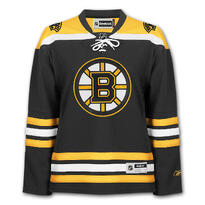
In recent years, major American sports teams have added uniforms that are significantly busier than their predecessors. The inclusion of more color, piping, and words has made some contemporary uniforms seem like experiments gone wrong. In hockey, valuing tradition is a vital part of the sport’s culture. Thus, wearing uniforms that stray too far from the simple threads of decades past should be avoided at all costs. The Original Six have made fewer changes to their uniforms than their competitors over the years, yet they are all ranked in the top eight on Lukas’s list. His message is clear: The best uniforms are the ones that have a classic feel.
4. Use a well-balanced color scheme.
Team hockey uniforms that resemble abstract paintings will not impress players, coaches, or fans. For example, Lukas ranks the St. Louis Blues near the bottom of his list because their “excellent jersey crest” is lost amidst all the clutter on their uniforms. Lukas is likely referring to the several different colors that the Blues prominently feature on their jerseys. These colors diminish the impact of the team’s music note logo. Essentially, an even distribution of two colors usually looks better than a mishmash of several.
Image Source: NHL Fan Shop
Share this Story


